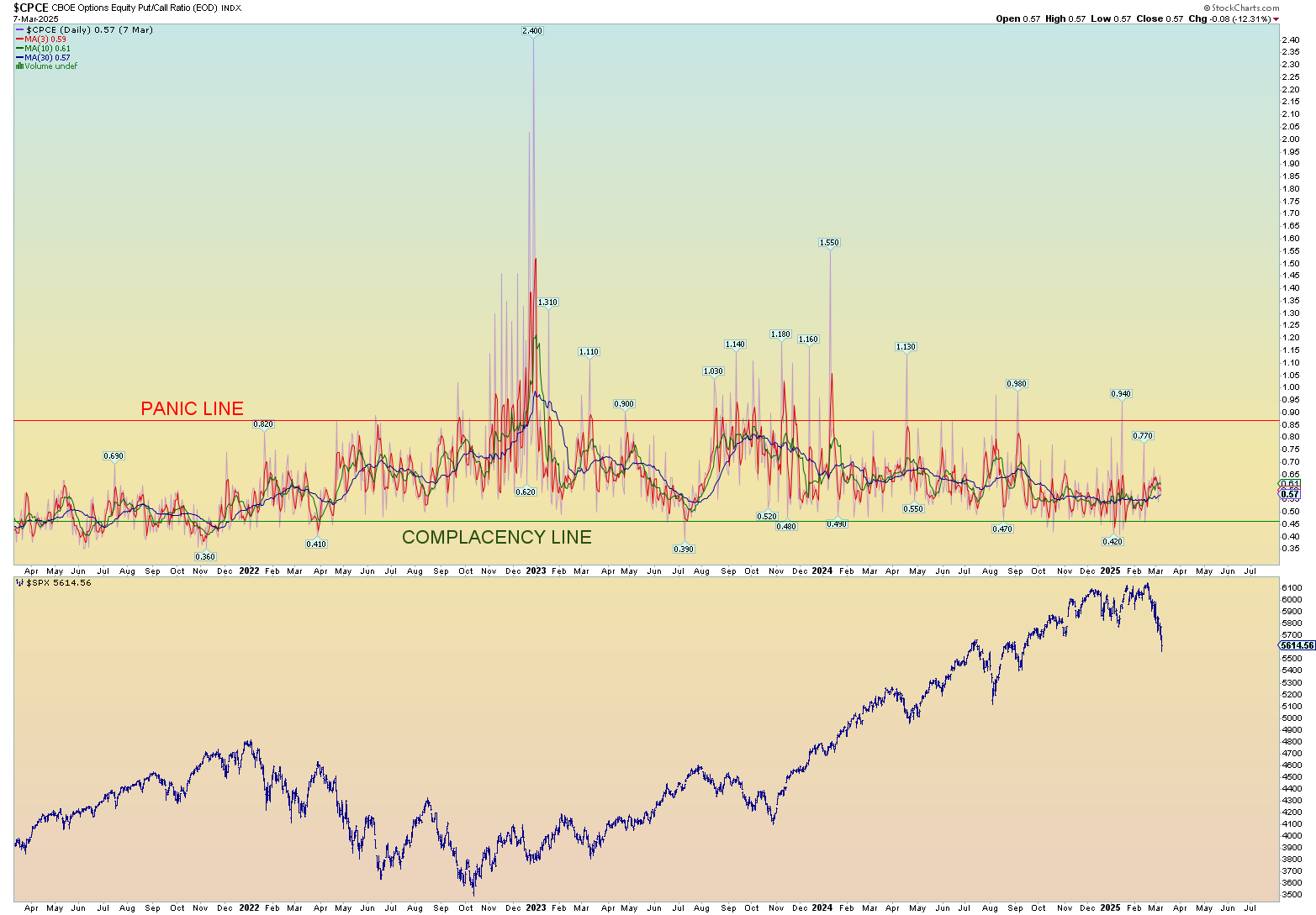
The talking heads speak of a bit of panic in the air and perhaps that is coming true. But as the saying goes, don’t do what I say, do what I do (or don’t do). So, let’s look at the actual put/call ratio – CPCE – the put/call action – as of Friday’s close (I won’t have today’s close until tomorrow on Stockcharts).
Long term is way more complacent:
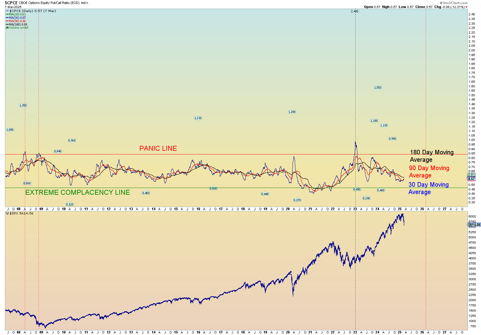
Shorter term shows zero days of panic as of yet. Nothing even close to the panic line on a daily basis. So don’t listen to the hype of the talking heads (blood in the water sells!). Look at what the actual money is saying. And that money still reflects an overall bullish sentiment rather than not.
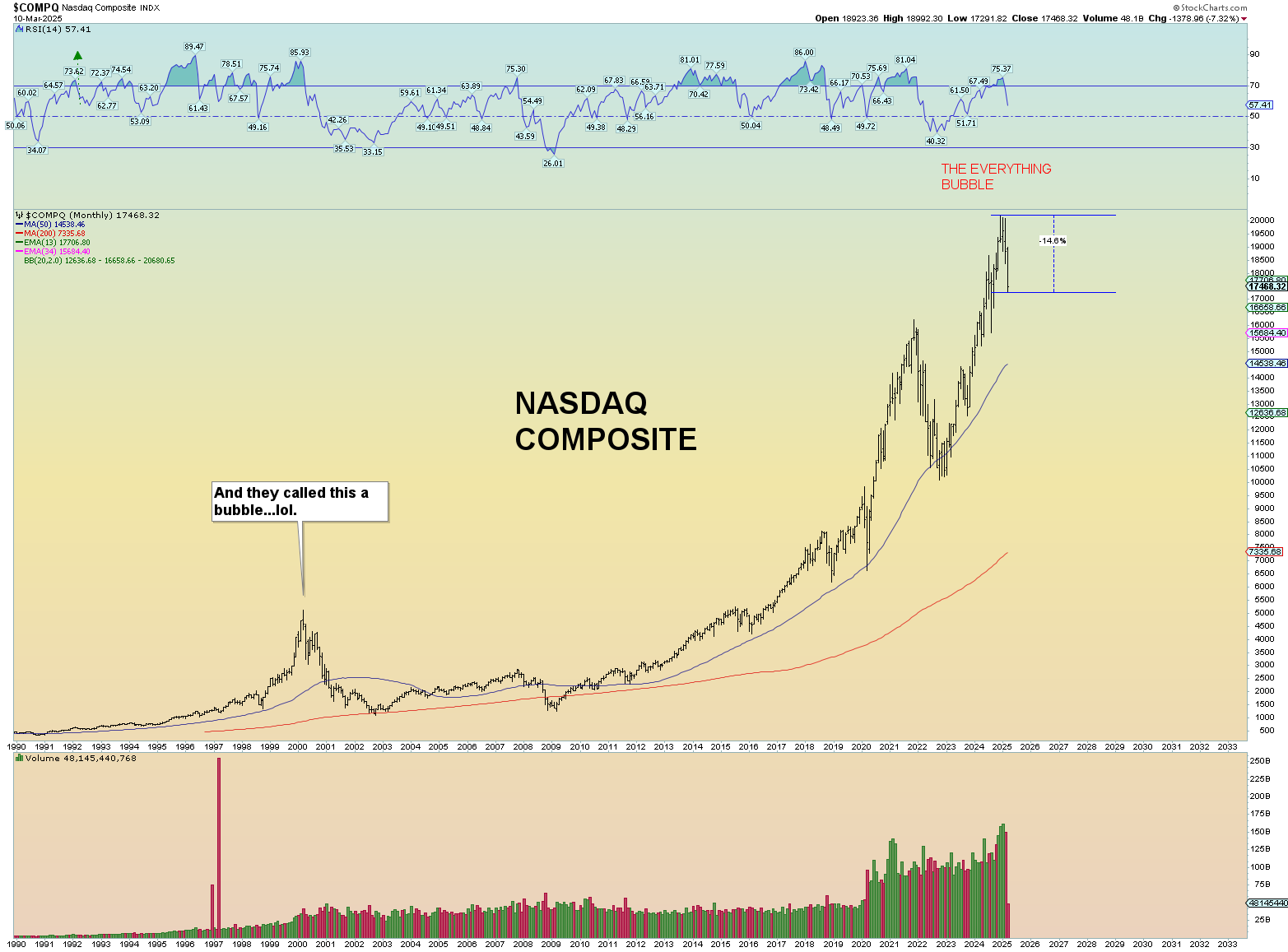
3 charts that show a disparity in losses.
The NASDAQ has lost the most so far:
With the SPX almost touching “correction” territory (-10%) today. And by the way, this squiggle count is a best guess wave structure at the moment. Flawed? Does it look corrective down or more getting on with an impulsive look down? It doesn’t scream “3 waves” corrective so I tend to lean toward impulsive down.
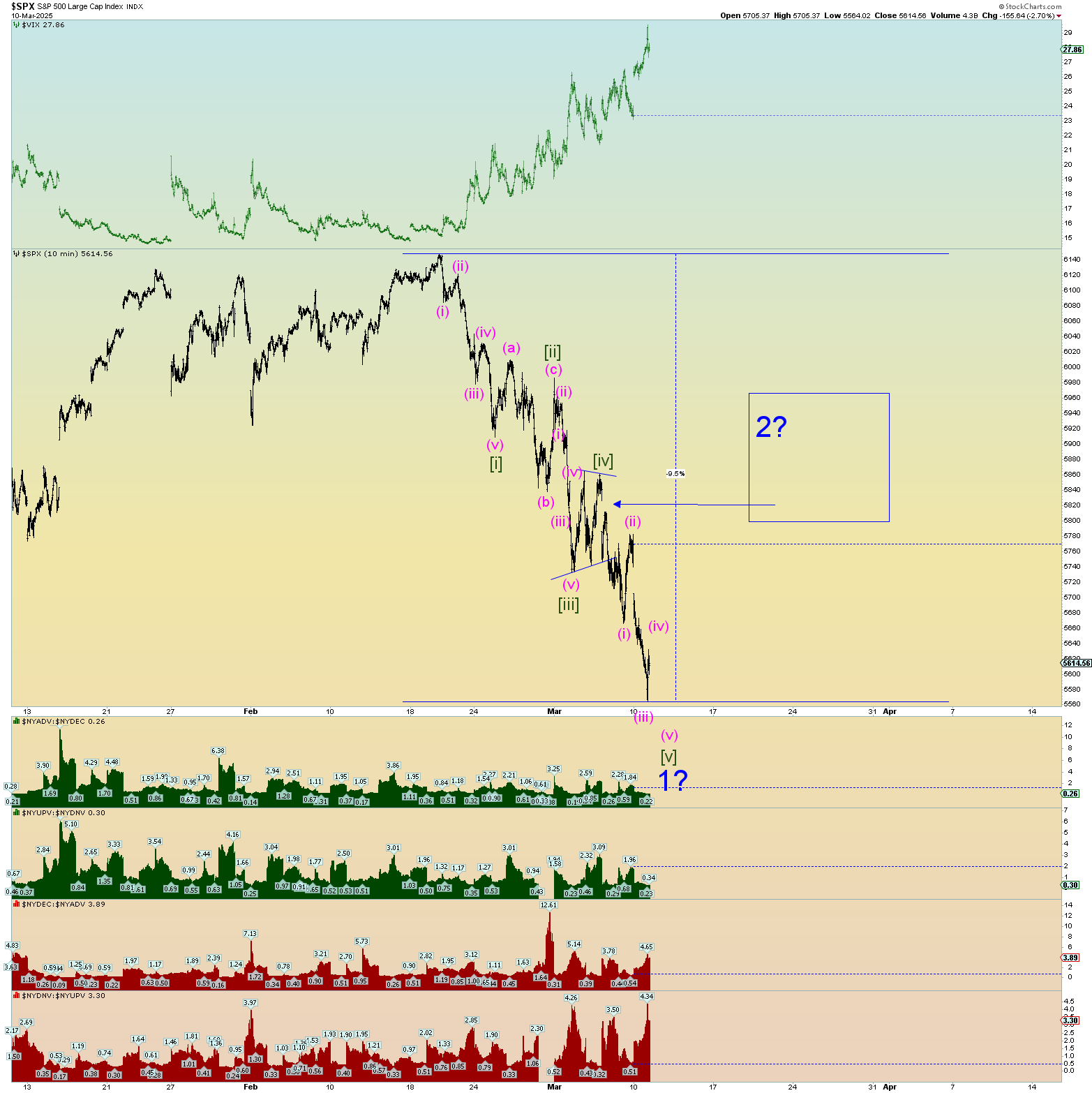
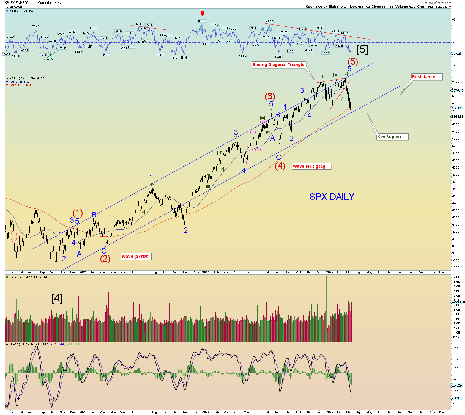
The daily shows a drop beneath significant horizontal support. What this means is that everyone who bought the SPX since about Sep 2024 is in risk of losing money. So any gains from here cause people to bail to “get out”. That is the psychology of support/resistance.
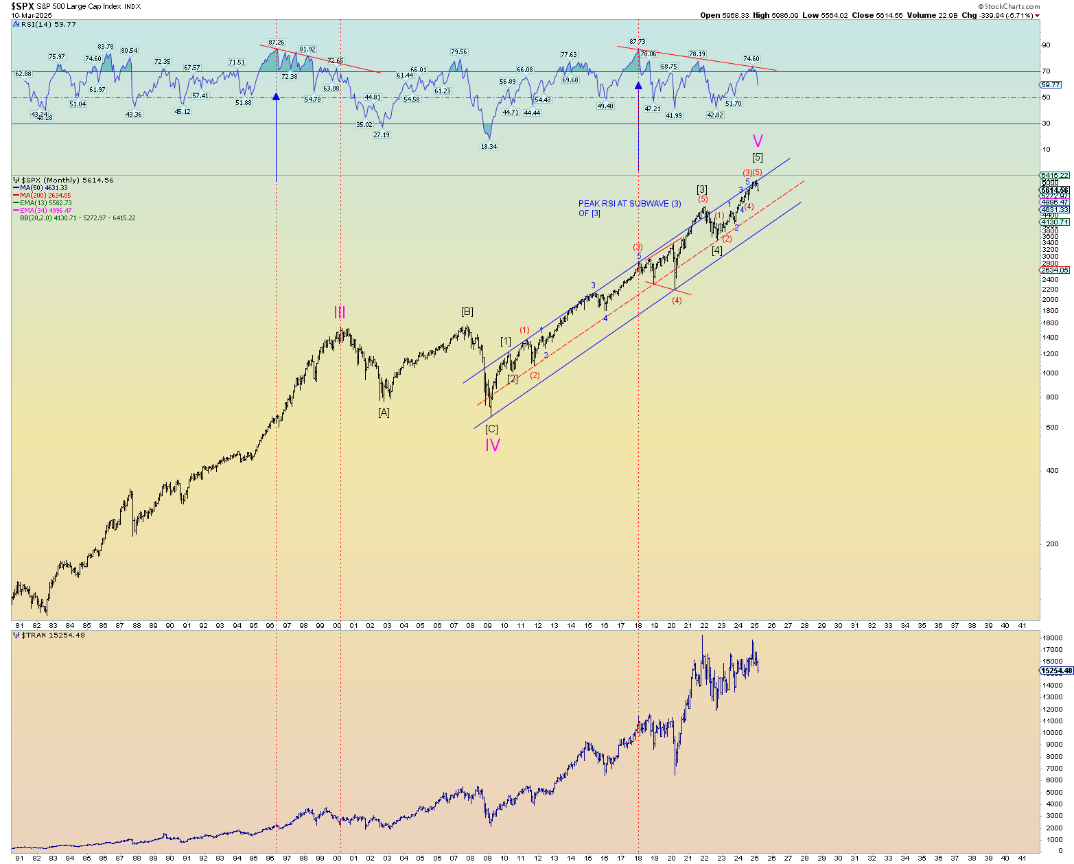
Yet the overall drop from a log scale is really just a blip, isn’t it? This is reflective that there is really not yet any true long-term panic despite whatever talking head wants you to believe. Blood sells! Now that the “evil” Trump is President, the media wants failure of the markets.
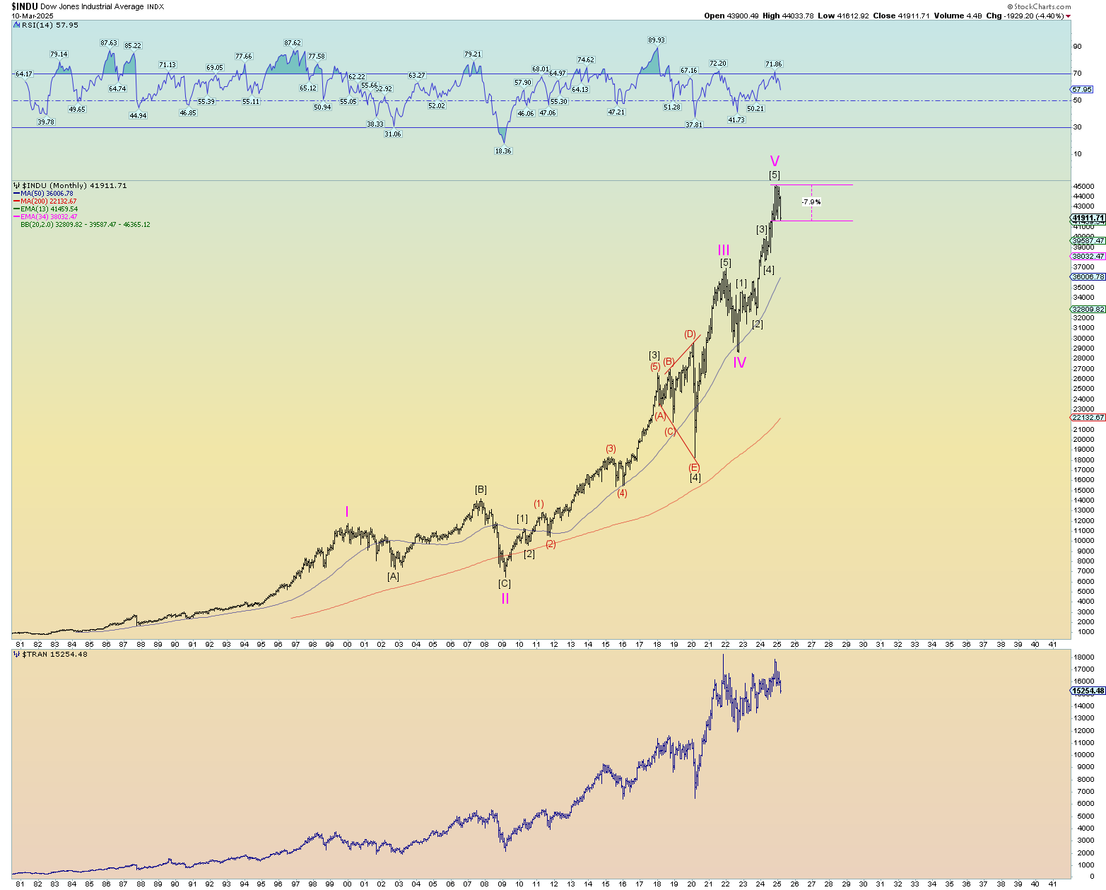
And finally, the Dow Jones Industrials are still standing tall as can be. The loss from peak is a little bit more than half of the NASDAQ at this point. But I think that’s how it was in 2000….